Designers, as a Frontend Developer, here are some things I DO NOT want from you

Implementing designs is tricky at the best of times. But you, as a designer, can make life easier.
Designs Delivered in Photoshop
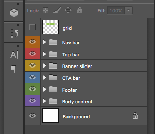
Photoshop, as the name suggests, if for editing photos. It's a great tool for that. It's a terrible tool for designing website. It slow. It's hard to get through all the layers to find out what I want. It gives me units in pixel sizes. It gives me pixels with decimal places. I only know what size a font is going to be at each size you give me the file (probably desktop and if I'm lucky mobile, but not tablet!); I've no idea what size they will be in between all these breakpoints.

Though I have serious misgivings about Sketch (or any static design tool), and it ultimately fails as bad as Photoshop when used to deliver designs to clients as PDFs or PNGs or whatever, it is a much easier (and cheaper) application to work with. Don't expect everyone to have €700 to shell out for Photoshop.
Basically, if you know me at all, you know how much ranting I have been doing about this over the last few years. If you don't, watch my DrupalCon Vienna 2017 talk how Photoshop and Sketch fail when delivering designs.
Me to Explain to YOU Why You made a Design Decision
If you choose to do something that you simply think "looks good" but have no actual reason for using it, it's not fair for me to have to explain back to you a few weeks later. For example, if you choose to use masonry for a layout, then ask me if we can make all masonry items the same height (in which case we probably should have just used Flexbox instead), I feel patronising when I have to explain back to you one of the reasons you probably chose masonry in the first place - so we can deal with variable height items.
Fields in Designs for the Sake of it
Think about your content. Think about your content strategy. Think about what fields you are putting in a design and why. I can't count the amount of times I have put in the effort to create and style fields only to be told later, "we liked it in the designs, but we can't think of content to put in it now. Can you remove this field?". You could have saved yourself some effort, and me some effort, and spent that time/effort/budget on something useful the client.
A Styleguide that is Out of Sync with the Designs
Styleguides are great. They tell me about font families, and font weights, and margins, and padding, and lots of other useful information. But I often receive designs (in PSD or Sketch format) and later I receive a styleguide. After going through some discussions with the designers, the designs often change, but sometimes the styleguide does not get updated. Then after more discussions between the designer and the client designs can evolve even more. Again, sometimes the styleguide does not get updated. And sometimes the styleguide is updated but the designs are not. And then ... everything is out of sync and we have no canonical source of truth for what we should be developing against.
Of course, you could fix this by just having one source of truth - a living styleguide, built with something like PatternLab or Fractal or something similar. Don't come near me with InVision or Sketch Cloud or any non-sense like that.
Colour Contrast that doesn't even Attempt to Meet WCAG AA Accessibility Standards
I'm not an accessibility expert. And I'm not a user experience expert.
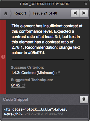
But common courtesy suggests to me that when we design a website, people should be able to read the text on it and people should be able to use it. Putting almost white text on a light grey background is not fair on users, and especially users who may have vision impairments. Same for buttons that barely change colour when hovered/focussed (or menu links for that matter).
When you meet someone in the street, you don't whisper under your breath to them, rendering the conversation useless since they can't hear you. Do the same with your web design. Be courteous ... make your text legible. Be understood.

Heading Tags Styled to Look Like Different Heading Levels
If you want a heading to be slightly smaller than the one above it, and the one above it is a H2 (for example), the chances are that what you want below it is a H3. If this is the case, use a H3 tag. If you just want to make something stand out a little, design a new element for me and I'll apply a class to it on the page. Do not say "this is a h1; and this is a h2; and this is a h6; and this is a h2", when what you actually mean is "I want this to look like X, and this here to look like Y, and this following item to look like Z".
Understand, as a designer, the basics of web semantics - at least headings, paragraphs, lists, form items, and landmark regions.
Ask Me to Leave Comments in InVision or Sketch Cloud
These "prototyping" tools are getting very popular. I've no idea why (well, I do, and I'll discuss it in a future blog post). You share your designs, you leave some comments, the client leaves some comments, I leave some comments, you leave some more comments ... soon we are in comment soup. I can't abide that. Use a ticketing system or flow system (like Trello) to collect feedback where we can all see the feedback per item in one easy to read place.
And Something I DO Want from You
Communication. Lots and lots of communication.
Taking me through the designs, letting me know that an image in your PSD is actually supposed to be a short looping video is a great help to me, so I don't enable an image field instead of a video field. Telling me when I click on your hamburger menu, it animates is another thing I'd like to know, but can't guess from something static like Sketch.
So, hold my hand ... treat me like your client ... expect that I will need help translating your beautiful design into a beautiful website.
And now, how can I, as a frontend developer, make your life as a designer easier?
Join the "Something nice ..." newsletter
The full title is "Something nice, something quirky, something else".
I send an email once a week with something nice, something quirky, and something else that I think is interesting (all with a web development theme, of course).