Designing for LocalGov Drupal

Understanding the templates and CSS variables for LocalGov Drupal means you can design at scale, quickly, with no loss of quality.
I've been working on a template design for LocalGov Drupal recently, which I will make available for free for anyone to use as their starting point.
Full disclosure: it will be the design that I use for an upcoming course I am going to release called "Build a LocalGov Drupal Website".
In this post I want to share some things to consider when designing for LocalGov Drupal.
Understand the LGD Template System
If you know what the LGD templates are going to output, you can design with that in mind. Why is this important? There are three main reasons:
- Your developers will not need to create custom templates for each component, allowing them to work faster.
- Any updates to LocalGov Drupal from the core team (e.g. if we fix an accessibility issue) will automatically be applied to your website when you update the codebase.
- Our templates are designed to follow the GOV.UK Design System patterns so should be very safe to use, saving your time/effort/money on researching new patterns.
An Example: the header
Our header template is quite complex, with a number of regions. It expects things in a certain order: Logo, Services dropdown button, Menu.
If you want to put things into a different order (logo, menu, services button) or add more to it (second menu above the main menu, search block, etc), then your developers will need to maintain a custom version of the header template. But not only that, a custom version of the header template cannot exist without a also overriding the general page template. We should file an issue to see if we can streamline this in the future, but for now, this is how it works.
In my course, we will use a custom header template so that we can see the process of what is involved.
Design Tokens
LocalGov Base theme has a lot of CSS variables for things like fonts, font sizes, widths, spacing, line-heights, and more. Most of these can be left as defaults (for example --spacing currently resolves to 1rem, and all other spacing variables are based on that (--spacing-large is calc(var(--spacing) * 1.5) - 1.5 times 1rem).
Try to only create new tokens/variables for things that are specific to your brand guidelines. These will probably include fonts, line-height, colours. If you think about this closely, the custom variables.css file that will be needed for your custom tokens could be as small as something like this:
body {
  --color-accent: #123456;
  --color-accent-2: #ffe146;
  --font-primary: roboto;
  --font-secondary: "Roboto Slab";
  --line-height: 2;
  --width-container: 72rem;
  --color-grey-lightest: #f5f5f5;
}
Designing a Styleguide
The styleguide you design can be as complex or as simple as you want. I like to keep them simple, so there is very little discussion needed about what is what, and even less maintenance for the future.
It's a good idea to have a grid system worked out for your page widths. The LGD grid system uses a 12-column grid, so it will make sense to follow that. You can set the max-width of your content area to whatever with you want. In the LocalGov Base theme there's a variable called --width-container. You can have that at any width you wish - 60rem (usually 960px) or 90rem (usually 1440px), etc. You can then apply that grid system to every frame in your Figma file, so when you design a component, it will automatically fit correctly in each page design.
Often I will just put the colours, fonts, and spacing scale into the design system. In Figma make sure to create a 'Style' for each of these so you can easily apply it to any item in your design. Here's an example:

Designing LocalGov Drupal Components
Components
LocalGov Drupal has a lot of components. Not all of them need a custom design. What you get "out of the box" should suffice for many needs (e.g. the accordion, quote, alert, etc components). With this being the case, let's focus on the custom designs that we will need. These might include things like:
- Header
- Footer
- Breadcrumbs
- Box Link
- Page Header - title and introduction/lede
- Link Block
- Top Task
- Call Out Box
- Image/Media with Text
- Card
- Teaser
If you need more, feel free to design more. But remember the more you design, the more you need to maintain and document.
Patterns
Once you have your individual components designed, it's time then to think about your patterns. Patterns are amalgamations of components (either multiples of the same component or individual components placed along with each other) to show how individual components should be used. You might design patterns for:
- Banner
- Box Links Listing (multiple box links to create an initial IA for a service)
- Page Header (page title and page introduction)
- Link Blocks (multiple link blocks to create a service listing)
- Card List (multiple cards for the featured news)
- Teaser List (multiple teasers for listing pages/search results)
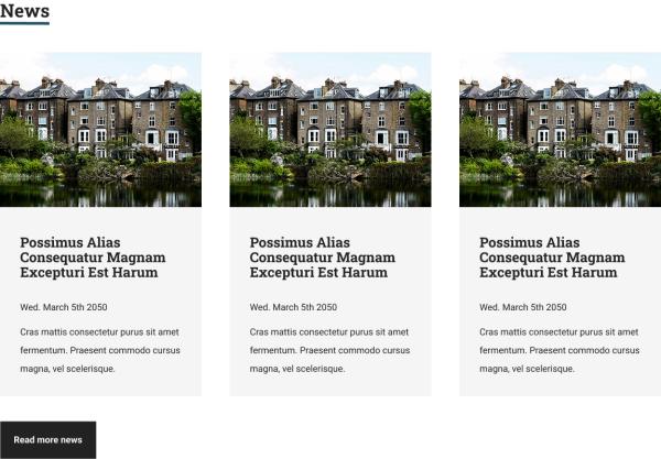
Here's an example of a card listing pattern with three components:
- Styled Header
- 3 Cards
- CTA Link

Designing LocalGov Drupal Pages
Now that we have our styleguide, our components, and our patterns mapped out, we are ready to start designing our pages.
Create a frame for each page you need. In my course will we design the following:
- Homepage
- Homepage with Alert
- Homepage with Promos (call out boxes)
- Service Landing Page
- Service Sub-Landing Page
- Service Page
- Directories Channel
- Step-by-Step Page
- Guide Page
- Listing Page (news, for example)
- News Page
- Blog Page
- Event Page
- Search Modal
Each component that goes onto a page at this point should be an "instance" of a component from your components directory. This means if you change the design of a component at the component level, all the instances of that component will also update. Some examples:
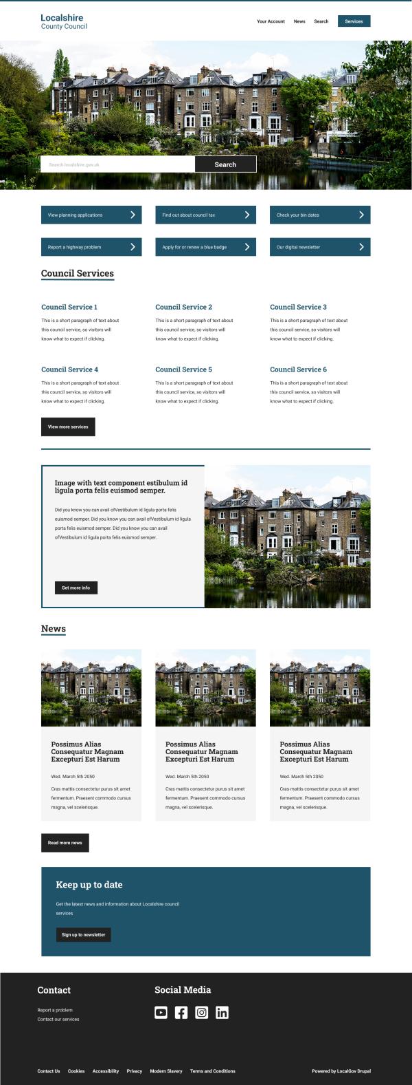
Homepage
- Header - component
- Banner - component
- Box Links - pattern
- Services Listing - pattern
- Image with Text - component
- Card Listing - pattern
- Call Out Box - pattern
- Footer - component
And that might look like this:

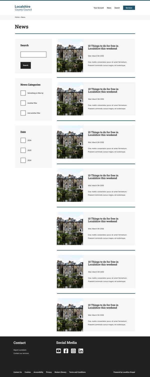
Listing Page (e.g. News)
- Header - component
- Breadcrumbs - component
- Page Header - pattern
- Divider - component
- Search Block - pattern
- Filter Block 1 - pattern
- Filter Block 2 - pattern
- Teaser Listing - pattern

Wrap Up
What we can start to see here is that it's possible to design beautiful LocalGov Drupal website, that follow the well-tested patterns of the GOV.UK Design System. By having an understanding of how the LocalGov Drupal base theme works, we can do this at scale, quickly, without sacrificing any quality. That's how we make the foundational aims of LocalGov Drupal a reality.
If you'd like to use this design as the base for your own, you can view the Figma file here.
If you'd like to get notification about the "Build a LocalGov Drupal Website" course, you can sign up for updates here.
Join the "Something nice ..." newsletter
The full title is "Something nice, something quirky, something else".
I send an email once a week with something nice, something quirky, and something else that I think is interesting (all with a web development theme, of course).