Get the Semantics Right, then the Styling Right: Try to Keep Everyone Happy

The web is a publishing platform. First things first, we should get our semantics right, just like we expect a book publisher to do.
Wes Bos had a tweet last night, showing him using a h2 tag but presenting it like a h1 tag.
Not sure if I'm proud or ashamed pic.twitter.com/ePyOBsMMEC
— Wes Bos (@wesbos) April 7, 2020
From my point of view, I don't see a problem with this. It separates the concerns between semantics and styling. What happens here is that your code says to screen readers and other parsers, "here is the order of my document, written in such a way that you can make sense of it". Then it says to people looking at your webpage, "here is the visual order of my website, presented in such a way that you can make sense of it".
I often receive designs that have a styleguide with a number of heading styles, h1, h2, h3, etc. I'll then create classes for .h1, .h2, .h3 etc or perhaps .heading--largest, .heading--larger, .heading--large, .heading etc. Then when I want to use these, I can just add those classes where I need them, leaving the element/semantics correct.
My response to Wes:
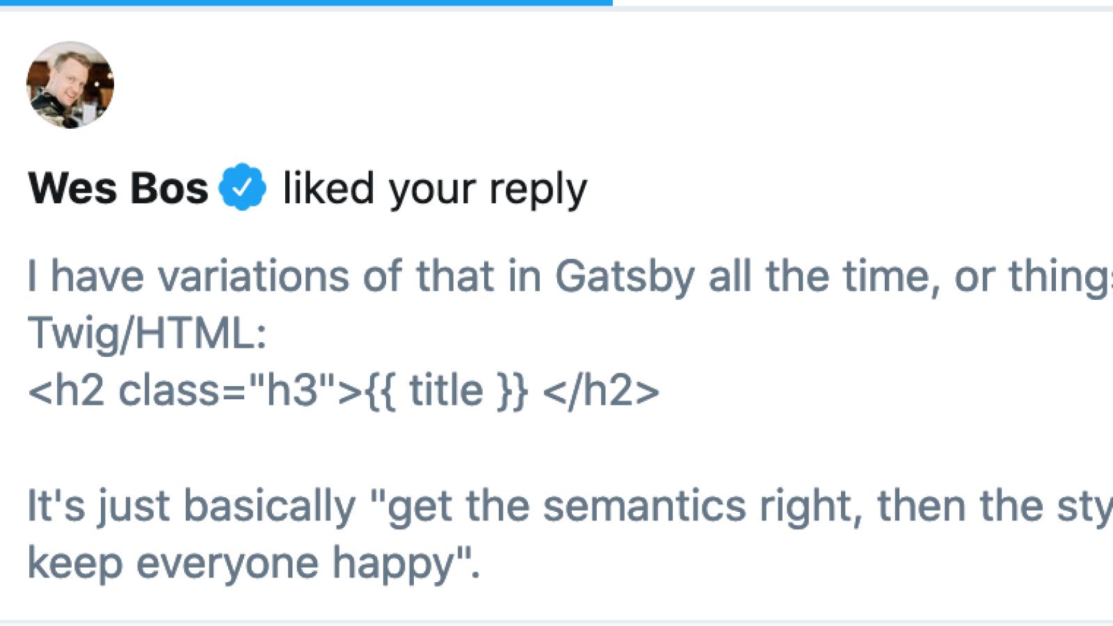
I have variations of that in Gatsby all the time, or things like this in Twig/HTML:
<h2 class="h3">{{ title }} </h2>
It's just basically "get the semantics right, then the style right, and try keep everyone happy".— Mark Conroy (@markconroy) April 7, 2020
Join the "Something nice ..." newsletter
The full title is "Something nice, something quirky, something else".
I send an email once a week with something nice, something quirky, and something else that I think is interesting (all with a web development theme, of course).