Placeholders are often a bad UX pattern
When the value of the placeholder is the same as the value you need in the field, it just looks like a disabled field.
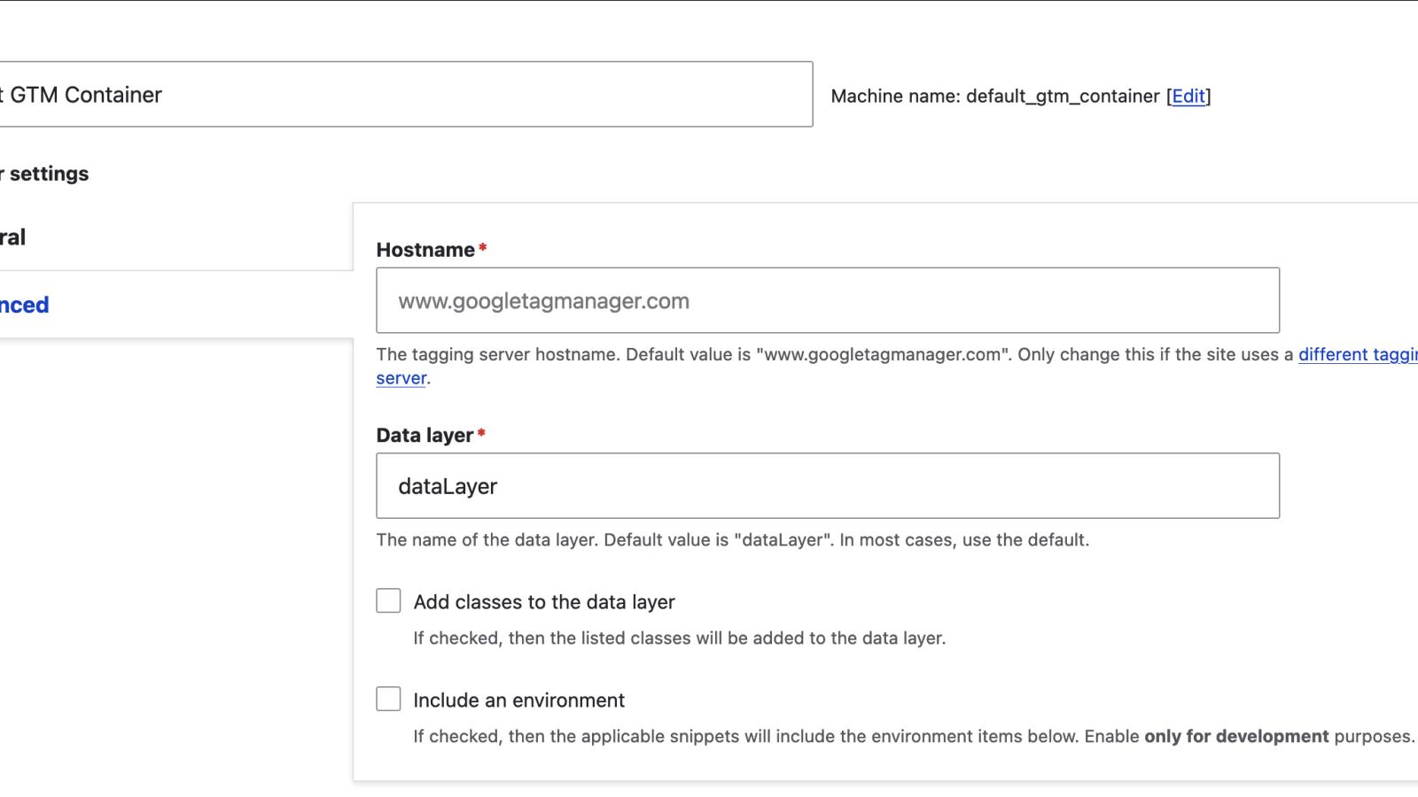
I had an issue today where Google Tag manager wasn't loading on a site for me on a Drupal site. I checked the settings over-and-over again, but couldn't see any issue.
Eventually I realised that we were missing the hostname. How did I miss this? Well, the hostname field had a placeholder which was exactly the value of the hostname needed, so it actually looked like it was filled in and the field value couldn't be changed (like a disabled field)
Here's an example of where placeholders can be a bad UX pattern. Maybe if the placeholder said "Add hostname here", it might be better. But again, it's not actually needed since the form label says "Hostname" and the description under the field tells me what I needed to do.
How did I find out that it was a placeholder and not an unchangeable value? When I tried to save the page after changing a different value, the page wouldn't save. Checking the browser's console told me "The invalid form control with name=‘hostname’ is not focusable."
Not a very helpful message but at least it inspired me to try to click on the field and then "Hey, presto!" the default value disappeared (since it was a placeholder, not a default value), allowing me to enter the hostname, save the form, and save the day!
Join the "Something nice ..." newsletter
The full title is "Something nice, something quirky, something else".
I send an email once a week with something nice, something quirky, and something else that I think is interesting (all with a web development theme, of course).