Drupal Planet

Printing Regions in Views in Different Places Using the Same Template

We had a case where on some views we needed to print the header above the exposed filters and on others we needed to print the header after the exposed filters. Here's my simple solution.

This is rather simple, in my views template (list.twig I call it, as I am using PatternLab), I created the following:

{% if not header_after_exposed and header %}
  {{ header }}
{% endif %} 

{% if exposed %}
  {{ exposed }}
{% endif %} 

{% if header_after_exposed and header %}
  {{ header }}
{% endif %} 

Now, in my corresponding views template in Drupal - views-view--search.html.twig - I just use that template and set the header_after_exposed variable to true.

 {% set header_after_exposed = true %} {% include '@content/list/list.twig' %} 

Join the "Something nice ..." newsletter

The full title is "Something nice, something quirky, something else".

I send an email once a week with something nice, something quirky, and something else that I think is interesting (all with a web development theme, of course).

PatternLab: Linking to Patterns

Linking patterns allows us to give our users a real feeling for how the website is going to work, on real devices, which things like InVision can never do. Here's some simple approaches.

When using PatternLab, you can link to a pattern by creating a variable such as {{ url }}. Then in your corresponding JSON or YML file, you can setting this variable equal to something like

url: link.pages-contact

or

url: link.pages-homepage.

We often use this when creating menu items, since in Drupal our menu items template looks for two parts to the menu link: title and url, something like this:

 menu: 
  items: 
    item_1:
       title: 'About Us' 
       url: link.sample-pages-basic-page 
    item_2: 
      title: 'Contact Us' 
      url: link.sample-pages-basic-page-contact-us 

This works great when working with a template that has a specific variable for the URL, such as the link to a node in node.html.twig, so we can link the title in our teaser template in PL to our sample blog pattern, for example.

But if we have a link field, such as a Call to Action in a paragraph bundle we might have something like this in our pattern:

<div class="cta__link">{{ cta_link }}</div>

and this in our corresponding YML file:

cta_link: 'Click Me!' 

We don't have PL paths in those links, because if we swap `#` for a `link.sample-pages-basic-page` it'll just render that as a string. And we don't want to break the variable into two parts, because in the Drupal template, we want to be able to {% set cta_link = content.field_cta %} and let Drupal do all its render magic.

The solution? Don't break up variable into two parts, concatenate what you want in YML instead to allow us to link to specific patterns:

cta_link: 
  join(): - '<a href="'
    - link.sample-pages-basic-page-with-quote
    - '">See Ways to Help</a>'

Now, the first part will render as a string, the second as a variable to the pattern you want to link to, and the third part as a string.

We could also create a link pattern, and do something like this:

cta_link: 
  include(): 
    pattern: 'organisms-link' 
    with: 
      url: 'link.sample-page-homepage' 

I don't, because, in general, I don't like patterns to depend on other patterns. This is simply so I can drag and drop them from project to project without any friction. Each component has everything it needs contained within it. It also means in case of something like a link field, we can let Drupal do as much of the heavy lifting as possible.

Join the "Something nice ..." newsletter

The full title is "Something nice, something quirky, something else".

I send an email once a week with something nice, something quirky, and something else that I think is interesting (all with a web development theme, of course).

Creating an 'Add to Calendar' Widget in Drupal

A simple request: we need an 'Add to Calendar' widget to add our events to Google Calendar, iCal, and Outlook. Simple (once I had completed it!).

There's a module for that. There is, it's called, obviously, addtocalendar. It works very well, if you:

If you don't want to use an external service for something as simple as adding an event to a calendar, then it looks like you'll need a custom solution. Their smallest plan only allows 2 events per month.

The PatternLab Part

Here's the custom solution I came up with (in the future, I'll look at creating a module for this with a settings/UI page for site builders). Note, it's a PatternLab implementation; if you don't use PatternLab and just want to work directly in your Drupal theme, it would be even easier.

Here's the code for the 'Add to Calendar' pattern in PatternLab (some classes and things are removed to make it easier to read):

{% set classes = [ "add-to-calendar" ] %} 

{% set ical_link = 'data:text/calendar;charset=utf8,BEGIN:VCALENDAR%0AVERSION:2.0%0ABEGIN:VEVENT%0ADTSTART:' ~ atc_start_date|date("Ymd\\THi00\\Z") ~ '%0ADTEND:' ~ atc_end_date|date("Ymd\\THi00\\Z") ~ '%0ASUMMARY:' ~ atc_title ~ '%0ADESCRIPTION:' ~ atc_details|striptags ~ '%0ALOCATION:' ~ atc_location|replace({'<br />
': ' ', '<br />
': ' ', '
<p>': ' ', '</p>
': ''}) ~ '%0AEND:VEVENT%0AEND:VCALENDAR' %}

{% set google_link = 'https://www.google.com/calendar/r/eventedit?text=' ~ atc_title ~ '&amp;dates=' ~ atc_start_date|date("Ymd\\THi00\\Z") ~ '/' ~ atc_end_date|date("Ymd\\THi00\\Z") ~ '&amp;details=' ~ atc_details|striptags ~ '&amp;location=' ~ atc_location|replace({'<br />
': ' ', '<br />
': ' ', '
<p>': ' ', '</p>
': ''}) %} 

<div{{ attributes.addclass="{{ classes }}"
  <a href="{{ google_link }}">Add to Google Calendar</a> <a href="{{ ical_link }}">Add to iCal</a> <a href="{{ ical_link }}">Add to Outlook</a> 
</div>


What does the above code do?

  • Creates a Google Calendar variable and creates an iCal variable. Outlook will also use iCal.
  • Uses these variables as links to add the event to their respective calendars.

Within the variables, we have some more variables (start date, end date, etc), which we should probably wrap in conditional statements so that their clauses don't print unless they are present in Drupal (some fields might be optional on your event content type, such as end time).

These variables are:

  • atc_start_date: Start Date and time
  • atc_end_date: End Date and time
  • atc_title: the name of the event
  • atc_details: description for the event
  • atc_location: place of event

In our Event pattern in PatternLab, we then have a variable called 'add_to_calendar' so that events have the option to have this widget or not. In event.twig, we simply print:

 {% if add_to_calendar %} {% include '@site-components/add-to-calendar/add-to-calendar.twig' %} {% endif %} 


The Drupal Part

In Drupal we create a boolean field on our event content type field_event_add_to_calendar, if this is ticked, we will display the Add to Calendar widget.

Here's the code from node--event--full.html.twig

{# Set the Add to Calendar Variables #} 

{% if node.field_add_to_calendar.value %} 
  {% set add_to_calendar = true %}
{% endif %} 

{% if node.field_event_date.value %} 
  {% set atc_start_date = node.field_event_date.value %} 
{% endif %} 

{% if node.field_event_date.end_value %} 
  {% set atc_end_date = node.field_event_date.end_value %} 
{% endif %} 

{% if node.title.value %} 
  {% set atc_title = node.title.value %} 
{% endif %} 

{% if node.field_event_intro.value %} 
  {% set atc_details = node.field_event_intro.value %} 
{% endif %} 

{% if node.field_event_location.value %} 
  {% set atc_location = node.field_event_location.value %} 
{% endif %} 

... 

{% include "@content/event/event.twig" %} 


To explain:

If the 'Add to Calendar' boolean is on, we set the add to calendar variable as true. This in turn tells patternlab to render the Add to Calendar component. We then check if each field we might use has a value in it - such as a start date and end date. If so, we map the values from each of those fields to variables in our Add to Calendar component (such as atc_start, atc_title, etc)

Now, when you view a node, you will see your Add to Calendar widget on any nodes that the editors choose to put it. You can see a sample of the Add to Calendar widget in my PatternLab.

Simple, once I figured it out.

Got an improvement for this? The comments are open.

Join the "Something nice ..." newsletter

The full title is "Something nice, something quirky, something else".

I send an email once a week with something nice, something quirky, and something else that I think is interesting (all with a web development theme, of course).

Can I Stop PatternLab Variants from Inheriting Data from their Parent Component

I have a card component with a title, image, text, and link. How come all my card variants are inheriting all the values from the default one? Short answer, you don't. It's a feature, not a bug.

Where this really becomes frustrating is when you have a pattern that lists a number of items in an array. In that case, all variants will have (at least) that many items, even though you may want fewer.

For illustration:

list.twig has something like this:

 {% for list_item in list_items %} 
  {{ list_item }} 
{% endfor %} 


Then list.yml has something like this:

 list_items: 
  - join(): 
    - include(): pattern: content-teaser 
  - join(): 
    - include(): pattern: content-teaser 
  - join(): 
    - include(): pattern: content-teaser
  - join(): 
    - include(): pattern: content-teaser 
  - join(): 
    - include(): pattern: content-teaser 
  - join(): 
-- loads of more teasers for the main listing page 

Now you want to create a variant of list such as list~related-articles, but with only 2 items. You'd expect this would work

 list_items: 
  - join(): 
    - include(): pattern: content-teaser 
  - join(): 
    - include(): pattern: content-teaser 

But, no. This will still render as many items as were in the parent component. That's the beauty (a feature, not a bug) of PatternLab's inheritance system. To stop it you need to do something like this:

 list_items: 
  - join(): 
    - include(): pattern: content-teaser 
  - join(): 
    - include(): pattern: content-teaser 
    - - - and so on, so each extra one is basically set to 'false' 

When we do this with a component such as a card, we might also want to have variants such as card~no-image, card~no-text, etc. In this case, we'd have a card.yml like so:

​card_title: 'My Card Title' 
card_image: '' 
card_text: 'The text of the card will go here'
​

However, if we create variants, each of the items in card will be inherited to the variant. You'll notice this if you try to create one super mega component for all variants of a hero component for example (hero title, pre-title, sub-title, image, alignment, cta buttons, etc).


In this case, what I do is create a default component card.yml or hero.yml and give it only values for items that will more than likely be in all variants (basically whatever you are going to mark as a required field in Drupal (or whatever CMS you are using)), then set all others to 'false' in the component. Now when I create variants I only need to override the specifics for that variant, since everything else that is being inherited is already set to false. I also create a 'Kitchen Sink' version of the component which shows every item in action but DO NOT create this as the default/reference component.


My default card.yml might look like this:

card_title: 'My Card Title' 
card_image: false 
card_text: false 

Now my variants can look as simple as:

card~with-image.yml

​card_image: ''

And card~long-title will be just one line:

 card_title: 'This is a long title on a card just to illustrate what happens when it wraps to more than one line' 

And that is why this is a feature, not a bug - it allows us to write variants very simply and quickly. Is there a better way of doing this? I'm not aware of one. If you are, drop it in the comments. Thanks.


Join the "Something nice ..." newsletter

The full title is "Something nice, something quirky, something else".

I send an email once a week with something nice, something quirky, and something else that I think is interesting (all with a web development theme, of course).

10 Thoughts on Running a Front-end Team for an Enterprise Website

10 Thoughts on Running a Front-end Team for an Enterprise Website

What would make for a first-class, enterprise-ready, front-end development team?

Regular Structured Communications

There can be a tendency to presume everyone knows what they are doing and should be allowed to work on their own initiative. This is a tendency I agree with, but it’s also of utmost importance to make sure others on the team also know what each person is working on.

Without regular, structured communications (at least weekly, if not daily, meetings), it’s quite possible for one person to work on a component (say a “tile” component) while another person works on another component (say a “card” component) and both of these components to be the exact same item. Except now we have two versions of the same component, just different names for them.

Without regular, structured communications, each team member is working in a silo, not aware of the whole of the project, and being responsible for only their section. This makes it harder to integrate each section of the site into each other. It will also mean it takes more time for the diligent developer to understand each part of the project if they wish to. Regular meetings save time.

One of the great things about regular, structured communications is that they lend themselves very well to team building. Let your team know you are very proud of how much has been achieved this sprint. Congratulate someone for solving a particular tricky issue. Allow a space for people to vent any issues they might be having.

Fewer Developers, More Focussed

It’s a truism and a paradox, but the more developers we have on a project, the longer the project is going to take to complete. Every new developer takes time to get up to speed with the codebase and slows down the momentum of the other team members. This causes projects to go over-time and over-budget.

This is not to say we should have only one developer per project, but I would suggest keeping teams as small as possible. A small number of really focussed developers will work much faster (having such an intimate knowledge of the codebase, feature set, sprint goals, etc.) than a large team of developers working on many small features. A large team lends itself too easily to people changing someone else’s code not expecting there to be any ramifications, to people “fixing” up another’s code because it doesn’t meet coding standards or has a security issue – work that shouldn’t have to be redone.

Use a Design System/Pattern Library

Pattern library tools have become very popular in the past few years. They allow everyone to see an inventory of the different components the team has available to work with when building web pages.

The tool I have chosen to standardise on is PatternLab. There are many others.

They also allow us to show our clients what the designs will look like on real devices, rather than images of what they might look like in InVision or some other tool like that. For years, yes literally years, I’ve been talking at conferences extolling the virtues of using a ‘Design in the Browser’ approach to front-end development and against the practice of using static design tools (Photoshop/Sketch) to deliver designs to clients. By all means, use these tools to deliver the designs to your team, but let the team code up the designs to deliver to your client.

Clients should be sent URLs, not PDFs.

One Component Per Design Feature

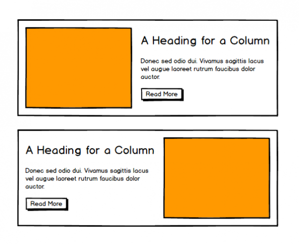
Once we are all agreed that we are going to use a pattern library tool, we can then start coding up the features of the front-end. Often components have variations of themselves. An example could be a “Card” component which has an image at the top, followed by a headline; with a variation which has the headline on top followed by the image. In this case we might create a card component and also a card—reversed component.

Card and Card Reversed Wireframe


Sometimes teams can fall into the trap of thinking that “everything” is a variation of a core component. So, for example, we might have a component which has an image on the left, a headline and some teaser text on the right and/or vice-versa. Surely we can just create a component variation such as card—columns and card—columns-reversed? Yes, we can. But then when we see another component that has the same layout, except the image is a different size, there is no teaser text, we have tags under the headline, etc., we are then going to need to make another variation of card— and yet another variation of card— and yet another variation of card— and so on. Technically this is possible, but in practice you are setting yourself up for a maintenance nightmare.

Column and Column Reversed Wireframe


The reason each of these components might look like variations on a core component is because they designers are following brand guidelines and using the same font, same sizing and rhythm rules, same colour scheme, etc. When you think about it like that, everything should look similar – it’s all supposed to fit together, but that doesn’t mean everything is a variation of a core component.

If we want to create all the variations of display types based off one core component, we are going to have a large core file, with a lot of logic and clauses and “if this then that” statements, and an equally large CSS file to take consideration of all the variations. This makes it harder to read the code, harder for new developers to get on-boarded to the project, and harder to maintain.

My suggestion is to create one component per display type. Based on the examples above, we would have a card component and a columns component. My files in PatternLab might look like this:

/card
– card.twig
– card.js
– card.scss
– card.yml
– card~reversed.yml
– card~no-teaser-text.yml
– card~no-teaser--text-reversed.yml
– card.md

/columns
– columns.twig
– columns.js
– columns.scss
– columns.yml
– columns~reversed.yml
– columns~no-teaser-text.yml
– columns~no-teaser-text-reversed.yml
– columns.md

This means that all the functionality and styling for the card component is within the card directory. It’s a small core file, with only variations for the image to be top/bottom or for there to be teaser text/no teaser text – very obvious variations of the card. The core file should be easy to read (one CSS class will create the variations), and it’s specific enough to know exactly what this component does.

We can set up a regression test for each component very easily to catch any curveballs that might arise later. None should arise if we use correct BEM naming conventions so that all styling for .card is prefixed with .card and all styling for .columns is prefixed with .columns, like so:

.card { css for card container }
.card__image { css for the image in the card }
.card__headline { css for the headline in the card}

.columns { css for columns container }
.columns__image { css for the image in the columns }
.columns__headline { css for the headline in the columns}

Focus on Features, Not Breakpoints

The Unix philosophy says “do one thing, do it well”. Taking this as a guiding principle, we should focus on developing one feature and completing it (the “card” component, for example) before moving to the next one. Sometimes I talk with teams and they tell me they focus on the desktop first or on the mobile screen views first and try to get the whole website looking correct at one breakpoint before moving on to the next one. While much of the code might be fine for each breakpoint, going over the code to catch all the issues for other breakpoints is going to take longer than completing each feature and having them signed off.

Remember, signed-off features can have regression tests written against each breakpoint. It also means that if the site is going to go over time, it’s possible to launch with a smaller set of (completed) features, rather than a feature-complete website, the front-end of which does not meet all the brand guidelines.

Automate Code Quality

Following coding standards can take time. You write your code, you check back over it, you fix up the indentation and comments style. And – you still miss something. The simple fix? Using code sniffers and/or linters and/or combing tools to automate this for you.

I have CSSComb set up in all my projects, so every time I save a CSS or SCSS file, it’s automatically formatted to follow the (Drupal) coding standards. I use prettier for my JS files, so again, each time I save my file, it’s automatically formatted to meet our coding standards. I have php_codesniffer installed and set to (Drupal) coding standards, so it notifies me each time I have an indentation wrong or something like that.

Why is this important? This is important when working as part of a team to make sure everyone’s code looks the same. It makes it much easier to read code from other developers when it is formatted the same as your code. It’s even more important when you edit a file that someone else has worked on and then try to commit those changes to git. How many of the changes were changes you made (that actually affect the code) and how many were just the csscomb or prettier auto-formatting your code? You want your git commits to be meaningful, so you only want the commit to announce the changes you have made.

What I do now on any file I need to work on is save it the moment I open it, so if another developer doesn’t have automated code checkers built-in, the file will format itself. Then I commit this save with the git commit message “running csscomb” or “running prettier”. After this, I make my changes and my commits are then meaningful – I can see the actual code I changed. This takes more time that it would if everyone just installed code formatting tools from the outset, and is something I think we should insist on for every project.

Front-end in Tandem with Site Building

The chances are that the designs are going to be sent to the client as Sketch files or PDFs or similar and not as PatternLab URLs (despite my best efforts to encourage this for years). Or maybe another agency won the contract to design the website and our agency won the contract to build/maintain it. If this is the case, by the time they get to the front-end developers, they are signed-off – a fait accompli.

Let’s turn this into a positive. As we are creating our front-end components (one component per design pattern, please!), we should also be building out the CMS functionality that this component will use. So, if we have a listing page showing teasers of events in a card display, then we should build out the fields (in Drupal or whatever CMS we use) that support this, and then create the configuration and templates needed to map 1-to-1 from Drupal to PatternLab.

This allows us to “dog food” our own work very early on. We can create our front-end and backend in tandem and make sure that both work seamlessly. We can ask our clients to sign-off on the front-end and CMS features at the same time; and we can then set up regression testing for the front-end and functional testing (with Behat or something else) for the backend. As the project progresses, we will have a featured-complete, fully-tested website and can move from feature to feature (or new feature to new feature during future phases of work) with less fear of things breaking when we make changes.
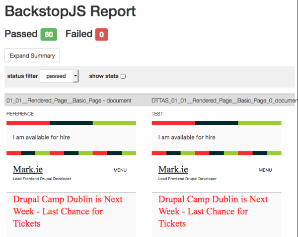
Regression Test

Here’s a joke: a css selector walks into a bar; a table in another bar across town falls over.

Writing front-end code can often be like playing Whack-A-Mole. It doesn’t have to be.

Regression testing is basically taking a screenshot of your website that you can use as a “reference” (this is what it is supposed to look like). Then, when you make a change, you can take automated screenshots of the site again to make sure that the only things changed were things you expected to change. The regression testing tool I use is BackstopJS.

An example: you have a header, a main content area, and a footer. You set up your reference shots when these are all signed off by the client. In a future sprint you are asked to change the main content area from 1220px wide to 1440px wide on desktops. You make the change, tell your regression testing tool to run the tests and then you get back a report showing you that the main content area is now wider than the header and the footer – as it should be. You see the header and footer were not affected so you can deploy this new item. Now, think about doing this for every component across your website! The regression testing suite will run all the tests in a matter of minutes (while you can be happily working on another feature – multitasking for the win!), whereas it could take you an hour to check everything and you might miss something.

Like automating code quality, automate regression testing: automate the boring things.

BackstopJS Regression Testing Report for Mark.ie


Set Time Limit for Being Blocked

If a developer is blocked on something and can’t figure out how to complete the task, that is time wasted. Developers need to know they can ask for advice and they need to know whom they should ask – probably the gatekeeper (see next section).

My general rule of thumb for this is: if I feel I am blocked and just looking at the screen for 15 minutes, I need to ask for help. If I haven’t an idea what to do to unblock myself and I’ve thought hard about it for 15 minutes, that’s enough of the company’s money spent on it.

Ask for help sooner rather than later so you can be as productive as possible.

Nominate Code Gatekeeper

If you need to have a large team of developers, you need to have a code gatekeeper: someone whose job it is to know what components are developed, what ones are in progress, and what is in the backlog.

The gatekeeper also needs to know who developed what component and in what manner, so any components that are re-usable are re-used and one-off components are kept to a minimum. It is the gatekeeper’s job to ensure that no component is developed more than once, just using different names (“card” and “tile” as we saw above).

When someone is blocked or unsure of something, they ask the gatekeeper for advice and guidance so they can continue working as soon as possible. As well as that, the gatekeeper can also step in and try to figure out a solution (or even a proof-of-concept for a solution) while the developer works on something else. When the gatekeeper has an approach figured out they can tell the developer about it and then the developer can get back to that feature as soon as possible. The gatekeeper is a pair of fresh eyes.

The gatekeeper might be the lead developer on the project or it could be a separate role. The gatekeeper should write as little code as possible for the actual production version of the site, and, rather, should focus on the high-level overview of the project and working on solutions to unblock developers.

Conclusion

That’s it. That’s my thoughts on putting together and running a front-end (or teams) that can effectively work on large, enterprise websites. If you have a small team or are a freelancer, I think what I have said above also holds true.

Any thoughts or comments, leave them below. Thanks.

Join the "Something nice ..." newsletter

The full title is "Something nice, something quirky, something else".

I send an email once a week with something nice, something quirky, and something else that I think is interesting (all with a web development theme, of course).

Responsive Images with PatternLab and Drupal - the easy way

Responsive images in PatternLab get a bit of a bad rap sometimes, because they are tricky to have in PL and Drupal. Here's my "easy way" of achieving it.

This came up today in the DrupalTwig Slack (join it). A user wanted to know how to use responsive images with the Emulsify Drupal theme. I don't use the Emulsify theme (yet - I will soon), though Four Kitchens, the geniuses who created it, have responsive images built in. Recently I created my own - simple and rudimentary, but it works a treat.

I first create a "Responsive Image" pattern. In this I have two files - responsive-image.twig and responsive-image.yml. Here's the contents:

responsive-image.twig:

<img srcset="{{ image_src_sets }}" sizes="{{ image_sizes }}" src="{{ image_src }}">

responsive-image.yml:

image_src_sets:
  join():
    - 'https://placeimg.com/500/500/nature 500w, '
    - 'https://placeimg.com/1000/750/nature 1000w, '
    - 'https://placeimg.com/1440/475/nature 1440w'

image_sizes: '(max-width: 600px) 100vw, (max-width: 960px) 100vw'

image_src: ''https://placeimg.com/1440/475/nature'

To use it in another component, I just call a variable and set that variable in the YML file.

For example, to call the hero image as a responsive image in my event component, I'll print this: {{ hero_image }}. Then in my corresponding event.yml file, I'll define the hero_image item like so:

hero_image:
  join():
    - include():
        pattern: 'basic-elements-responsive-image'
        with:
          image_src_sets:
            join():
              - 'https://placeimg.com/600/600/tech 500w, '
              - 'https://placeimg.com/1200/360/nature 1000w'
         image_src: 'https://placeimg.com/1200/360/nature'

The {{ image_src }} variable is needed to provide a default fallback for browsers that don't support srcset or sizes, such as IE9/10/11.

Then in my Drupal template I just swap my image field variable for the responsive image one, like this:

{% if node.field_hero_image.value %}
  {% set hero_image: content.field_hero_image %}
{% endif %}
{% include ... usual path to component stuff ... %}

Drupal then renders the image field using whatever settings I have given it in Drupal - presumably responsive image ones.

This post might not help you if you are using Emulsify, but it might help others who stumble upon it.

Join the "Something nice ..." newsletter

The full title is "Something nice, something quirky, something else".

I send an email once a week with something nice, something quirky, and something else that I think is interesting (all with a web development theme, of course).

Creating a Card Component in PatternLab and Mapping to Drupal the "right" way

Yes, I know, there's more than one way to integrate PatternLab with Drupal. Here's how I create a card component and map it to Drupal.

Here's the task - create a card component with fields for:

  1. Card Image
  2. Card Title
  3. Card Body
  4. Card Link URL
  5. Card Style (sets a colour for a border-top on the card)
  6. Card Size (sets the width of the card)

In PatternLab, here's what our Twig file might look like (with explanations after it):

{%
set classes = [
  "card",
  card_image ? 'card--has-image',
  card_style ? 'card--' ~ card_style,
  card_size ? 'card--' ~ card_size,
]
%}

{% if card_link_url %}
  {% set element = 'a' %}
  {% else %}
    {% set element = 'div' %}
{% endif %}

<{{element}}{{ attributes.addClass(classes) }}{% if card_link_url %} href="{{ card_link_url}}"{% endif %}>

  {% if card_image %}
    <div class="card__image">
      {{ card_image }}
    </div>
  {% endif %}

  <div class="card__content">

    {% if card_title %}
      <div class="card__title h1">
        {{ card_title }}
      </div>
    {% endif %}

    {% if card_text %}
      <div class="card__text">
        {{ card_text }}
      </div>
    {% endif %}

  </div>

</{{element}}>

{% block content_variable %}
  {#
    This allows the cache_context to bubble up for us, without having to
    individually list every field in
    {{ content|without('field_name', 'field_other_field', 'field_etc') }}
  #}
  {% set catch_cache = content|render %}
{% endblock %}

The classes array at the top allows us to set variations for our card, depending on values chosen by the editor. So, if there is an image, we add a class of .card--has-image; if a style is chosen, we add a class of that style, for example: .card--medium (I create options for small, medium, large, and full - with 'small' being the default - corresponding on large screens to a width within their container of 33%, 50% 66% and 100% respectively).

Next, we set our {{ element }}. This allows us to have the card wrapped in an a tag or a div tag. We check to see if the link field has been filled in and, if so, we use the a element, but if not, we use the div element instead. This will render HTML like one of the following:

<a class="card" href="#">
  CARD STUFF GOES HERE
</a>
<div class="card">
  CARD STUFF GOES HERE
</div>

Following this, we check if there is an image and, if so, we render our image div. Checking first allows us to have nice bem-style classes, but also means we don't end up rendering emtpy divs. Although, when it comes to Drupal, what's another div!

We then do the same for the title and body.

The funny looking part at the end about cache was inspired by an article about Drupal block cache bubbling by PreviousNext. The specific code came from this Drupal.org issue. The PreviousNext article says to render the {{ content }} variable with our fields set to 'without', because without the {{ content }} variable rendering, caching is not working properly (I don't know enough about caching to explain more). However, on a content type with loads of fields, it's very cumbersome to add every field in with {{ content|without('field_image', 'field_tags', 'field_other', etc) }}. Instead, I put that {{ catch_cache = content|render }} at the bottom of each of my content patterns - node, block, paragraphs, etc, then don't need to add it later in Drupal.

The SCSS for this looks like this:

// Theming individual cards

.card {
  width: 100%;
  margin-bottom: $base-line-height;
  border-top: 0.5rem solid $c-primary;
  background-color: $c-grey--lighter;
}

a.card {
  text-decoration: none;
  &:focus,
  &:hover {
    background-color: $c-primary;
    background-image: linear-gradient($c-primary, darken($c-primary, 15%));
  }
}

.card--has-image {
  background-color: $c-white;
}

.card--small {
  @include breakpoint($bp--medium) {
    width: calc(33% - 2rem);
  }
}
.card--medium {
  @include breakpoint($bp--medium) {
    width: calc(50% - 2rem);
  }
}
.card--large {
  @include breakpoint($bp--medium) {
    width: calc(66% - 2rem);
  }
}
.card--full {
  @include breakpoint($bp--medium) {
    width: calc(100% - 2rem);
  }
}

.card--primary {
  border-top-color: $c-primary;
}
.card--secondary {
  border-top-color: $c-secondary;
}
.card--tertiary {
  border-top-color: $c-tertiary;
}
.card--quaternary {
  border-top-color: $c-quaternary;
}
.card--quinary {
  border-top-color: $c-quinary;
}
a.card--primary {
  &:focus,
  &:hover {
    background-color: $c-primary;
    background-image: linear-gradient($c-primary, darken($c-primary, 15%));
  }
}
a.card--secondary {
  &:focus,
  &:hover {
    background-color: $c-secondary;
    background-image: linear-gradient($c-secondary, darken($c-secondary, 15%));
    .card__text {
      color: $c-white;
    }
  }
}
a.card--tertiary {
  &:focus,
  &:hover {
    background-color: $c-tertiary;
    background-image: linear-gradient($c-tertiary, darken($c-tertiary, 15%));
    .card__title,
    .card__text {
      color: $c-white;
    }
  }
}
a.card--quaternary {
  &:focus,
  &:hover {
    background-color: $c-quaternary;
    background-image: linear-gradient($c-quaternary, darken($c-quaternary, 15%));
    .card__title,
    .card__text {
      color: $c-white;
    }
  }
}
a.card--quinary {
  &:focus,
  &:hover {
    background-color: $c-quinary;
    background-image: linear-gradient($c-quinary, darken($c-quinary, 15%));
    .card__text {
      color: $c-white;
    }
  }
}

.card__content {
  padding: $base-line-height;
}

.card__title {
  color: $c-grey--darker;
  font-family: $ff--alternate;
}

.card__image img {
  width: 100%;
  height: auto;
}

.card__text {
  color: $c-grey--dark;
  p:last-of-type {
    margin-bottom: 0;
  }
}

We can do the site building very easily with the paragraphs module. Create a paragraph of type card, add the fields

  1. Card Image - media image
  2. Card Title - text (plain)
  3. Card Body - text (long, formatted)
  4. Card Link URL - link
  5. Card Style (sets a colour for a border-top on the card) - text (list)
  6. Card Size (sets the width of the card) - text (list)

Then, in our paragraph--card.html.twig file, we write the following code:

{% if paragraph.field_p_card_style.value %}
  {% set card_style = paragraph.field_p_card_style.value %}
{% endif %}

{% if paragraph.field_p_card_size.value %}
  {% set card_size = paragraph.field_p_card_size.value %}
{% endif %}

{% if paragraph.field_p_card_link.value %}
  {% set card_link_url = content.field_p_card_link.0['#url'] %}
{% endif %}

{% if paragraph.field_p_card_image.value %}
  {% set card_image = content.field_p_card_image %}
{% endif %}

{% if paragraph.field_p_card_title.value %}
  {% set card_title = content.field_p_card_title %}
{% endif %}

{% if paragraph.field_p_card_text.value %}
  {% set card_text = content.field_p_card_text %}
{% endif %}

{% include "@building-blocks/card-layout/_card.twig" %}

What the above does is checks if the card paragraph has values in its fields and then sets variables if it does. This means we don't render empty divs.

You will also notice that I render each field's full content for image, title, and body. This is to keep all the Drupal goodness we have in the attributes object - for accessibility and to make sure things like contextual links/quick edit still work.

You will often see the same template written like this:

{% include "@building-blocks/card-layout/_card.twig"
  with {
    card_style = paragraph.field_p_card_style.value,
    card_size = paragraph.field_p_card_size.value,
    card_link_url = content.field_p_card_link.0['#url'],
    card_image = content.field_p_card_image,
    card_title = content.field_p_card_title,
    card_text = content.field_p_card_text
  }
%}

I find doing that leads to fields such as {{ content.field_image }} always returning true because of Drupal's rendering system. So, even if we don't have an image, we'll still have an image div, whereas doing an explicit check before we {% include %} our variable seems much safer.

That's it - PatternLab + Drupal integrated beautifully (I think) the "right" way (according to me - you might differ).

===

You can see a sample of this in action on this site's PatternLab.
Note - I call cards in my PatternLab 'tiles' and make them part of a wrapper component called 'Tiled Layout', which allows me lots of flexibility for cool layouts with little effort.

Join the "Something nice ..." newsletter

The full title is "Something nice, something quirky, something else".

I send an email once a week with something nice, something quirky, and something else that I think is interesting (all with a web development theme, of course).

Exclude Current Node from List of Related Nodes by Taxonomy Term

You know the scenario - you want to list nodes that have the same taxonomy term(s) as the node you are currently viewing. Easy, but you also want to exclude the currently-being-viewed node from the list. Always trips me up.

Each time I have to do this, I read a blog or two or a Drupal issue or two and still I always end up with a quirk. Here's what I normally do:

  1. Create the view
  2. Add a contextual filter for the taxonomy field you want to filter by
  3. Provide default value
  4. Taxonomy term ID from URL
  5. Load default filter from node page, that's good for related taxonomy blocks
  6. Limit terms by vocabulary
  7. Click Apply

Now I'm Stuck

This gives you a list of nodes related to the current one, but the current node will always show up in your list. If you edit that contextual filter and expand the 'More' tab at the end, and then choose 'Exclude: If selected, the numbers entered for the filter will be excluded rather than limiting the view.' you will be forgiven for thinking this will exclude the current node. IT WON'T. In this case, it will exclude the currently selected taxonomy term - which is the opposite of what you want to do.

The Solution? Another Contextual Filter

  1. Create another contextual filter for 'ID', as in, the Node ID.
  2. Provide default value
  3. Content ID from URL
  4. Scroll to bottom of page and expand the 'More' tab
  5. Click Exclude: If selected, the numbers entered for the filter will be excluded rather than limiting the view.

Now, the second filter will exclude the currently-being-viewed node, while the first filter will do the related-node-taxonomy-magic-dance.


Join the "Something nice ..." newsletter

The full title is "Something nice, something quirky, something else".

I send an email once a week with something nice, something quirky, and something else that I think is interesting (all with a web development theme, of course).

Getting Value (URI) of a Drupal Media (File) Field from within a Twig Template

To the future or to the past, to a time when thought is free, to the next time when I need to get the value of file field to use as a variable in Drupal 8 with Twig.

Working my way down through one of Drupal's render arrays of doom to try to get the URI of a file in a media field (in a paragraph type), I came up with this. If you can improve it, feel free to drop a note in the comments:

{% set slide_url = file_url(content.field_p_ei_speaker_slides[0]['#media'].field_m_file_file.entity.uri.value) %}

In steps:

  1. Get the {{ content }} variable
  2. Drill down into the media field (Speaker Slides - pdf, ppt, etc)
  3. Get the first element (0 - it's not a multi-value field in this case)
  4. Load up the #media object
  5. Interrogate the field on the media entity that has the file attached (the File field)
  6. Load this entity (entity here is not presented as an item in the {{ dpm() }} but it's very handy to know
  7. Get the uri.value from here
  8. Wrap it all in a file_url() function

For clarity, here's what I had in PatternLab:

  {# Begin Slides Download #}
  {% if event_slide_download %}
    <div class="event-item__slides">
      <a href="{{ event_slide_download_link }}">
        {% include '@basic-elements/icons/_svg.twig'
          with {
            svgpath : '@basic-elements/icons/svg/download.svg'
          }
        %}
      </a>
    </div>
  {% endif %}
  {# End Slides Download #}

And here's what I have in the corresponding Drupal paragraph.html.twig tempate:

{% if paragraph.field_p_ei_speaker_slides.value %}
  {% set event_slide_download = true %}
  {% set slide_url = file_url(content.field_p_ei_speaker_slides[0]['#media'].field_m_file_file.entity.uri.value) %}
  {% set event_slide_download_link = slide_url %}
{% endif %}

{% include "@building-blocks/event-section/event-item.twig" %}

So now, my future self, you will know where to find this next time.

For posterity, here's a blog by Norman Kamper on how to create a custom field formatter, written as a response to this post, and the code is available on github. Thanks Norman.

Join the "Something nice ..." newsletter

The full title is "Something nice, something quirky, something else".

I send an email once a week with something nice, something quirky, and something else that I think is interesting (all with a web development theme, of course).

Drupal's Settings Tray Module is Freakin' Awesome

Drupal Settings Tray demo

Here's a very short video demo of editing a menu using Drupal's Settings Tray module. Things like this will be what drives Drupal adoption.

I'm a big fan of the quick edit module for Drupal. If it could work better with paragraphs module, it'd be a knockout feature. Aligned with that, I'm really impressed with the settings tray module and can see so many uses for it in the future - sidemenus, shopping cart slideouts, node editing, etc. Here's a very short video of using it to edit a menu, which should make many content editors' lives easier.

Join the "Something nice ..." newsletter

The full title is "Something nice, something quirky, something else".

I send an email once a week with something nice, something quirky, and something else that I think is interesting (all with a web development theme, of course).